The website has moved to .com
Last week we transfered the website to a new domain and a new Web hosting service. Ymir is now ymir-online.com, though the .eu will still be valid for a while. The website should now be way more reactive and faster to load.
Region size doubled
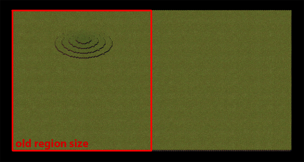
After working on the world-map display, last week i worked on the new region display. Framerate and loading times have been greatly improved. Enough to actually decide to double the size of regions compared to the previous prototype.
Before , regions were visually square, which was a bit weird considering that because of the isometric perspective it meant the actual region surface was therefore a vertical strip. The new regions are now visually rectangular, making the surface square and matching the worldmap’s representation of regions.
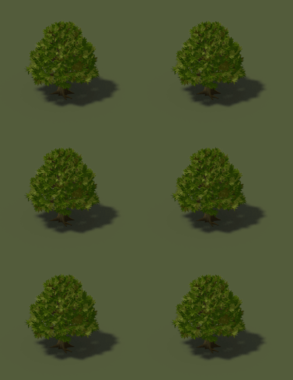
New trees
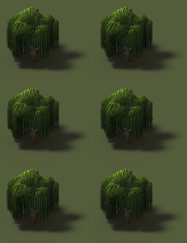
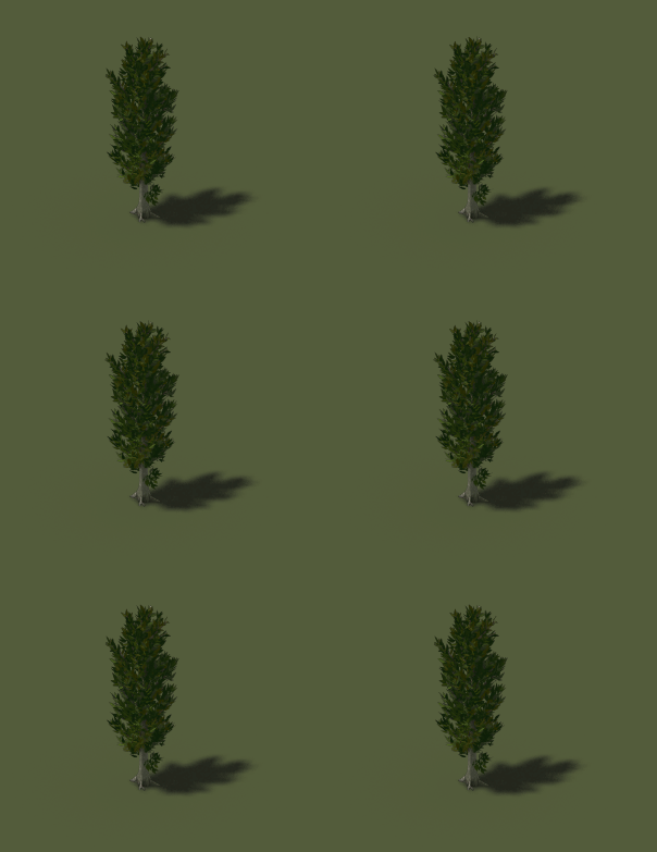
Alpyro is still working on the vegetations of the game, making new trees for all the climates!


Well regions were visually square, like in the screen i put in the article.
But because what you see in the viewport is an isometric view of the terrain where the Y axis is squashed compared to the X axis (because its in “perspective”) , it meant that the buildable area in terms of tiles was actually a vertical strip.
Its made obvious in this old news where i had put a debug render of a pathfinding grid : http://ymir-online.com/whats-been-done-in-the-last-few-months/
Nice trees. I don’t remembered than regions appeared as “tall rectangles” in the past, but if you say so … oh well, bigger regions means bigger towns to build. So it’s great, of course. 🙂
It’s just a GIF made from the sprite, the animation ingame won’t be as fast indeed ! 🙂
Good! I love weeping willow (i learn new word ^^) But it mouv a litle fast no?